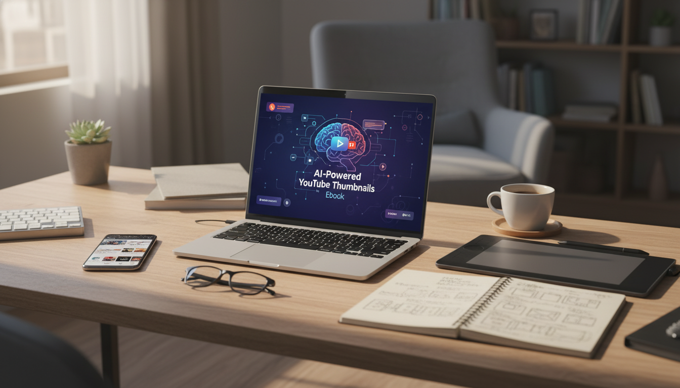
A strong thumbnail earns attention in a crowded feed—often before a title is even read. AI can speed up the design process, generate multiple directions quickly, and help creators stay consistent across a channel without spending hours in a design tool. The key is using AI for what it’s best at (fast variation and cleanup) while keeping quality, clarity, and brand identity front and center. For more guidance, see How to Generate YouTube Thumbnails with AI: Step-by-Step.
High-performing thumbnails tend to follow a few repeatable rules—regardless of niche.
Use this as a repeatable loop. The goal is a dependable process that produces strong options fast—not a one-off masterpiece.
Pick one angle only (mistake, myth, shortcut, comparison, challenge, result). If the thumbnail tries to communicate three angles at once, it usually reads as noise in the feed.
Start with the best “real” assets available: a clean face photo, a product shot, or a simple screenshot. If the background is busy, plan to remove it or blur it so the subject stays dominant.
Write three tiny hook options that fit in 1–4 words. Aim for words that add clarity or tension, not words that repeat the title.
Ask for variations in (a) subject size, (b) left vs. right placement, and (c) background style—such as a clean gradient, solid color, or blurred context. You’re looking for one layout that “reads” instantly before you worry about polish.
Refinement is where AI should serve your intent. Remove extra objects, tighten the crop around the face/subject, and boost contrast between foreground and background. If the focal point doesn’t pop at a glance, nothing else matters.
Lock in a consistent color accent, one font family, and a recurring element (border, corner tag, or shape). Over time, this makes the channel’s thumbnails recognizable even when the viewer doesn’t read the text.
Confirm readable text at small size, avoid overly thin fonts, and ensure the image communicates without relying on text. If the thumbnail still works when the text is removed, it’s usually strong.
| Check | What to look for | Fast fix |
|---|---|---|
| Mobile readability | Main subject and text are clear at small size | Increase subject size; reduce text to 1–4 words; boost contrast |
| Single focal point | One obvious element draws the eye first | Remove extra icons/arrows; simplify background |
| Color separation | Subject stands out from background | Add rim light/glow; darken background; use complementary colors |
| Truthful promise | Thumbnail matches the video’s outcome | Swap exaggerated claims for a concrete result or clear question |
| Brand consistency | Looks like it belongs on the channel | Use a consistent font, color accent, and framing style |
A guided format helps creators move from random experiments to a repeatable workflow: idea selection, layout generation, refinement, branding, and final export checks. For a step-by-step sequence with checklists and a practical system, see the AI-Powered YouTube Thumbnails Ebook.
If building a consistent creative habit is part of the plan, the Money Mindset Makeover: Step-by-Step Guide to Financial Well-Being can help support long-term consistency and follow-through.
The recommended size is 1280 × 720 pixels (16:9). Use JPG, PNG, or GIF, and keep the file under 2 MB; always preview at a small/mobile size to confirm readability and keep key elements away from the extreme edges.
They can, but results depend on the concept, clarity, and how well the thumbnail matches the video. AI is most valuable for speed and generating multiple variations, while human judgment and testing usually determine the winner.
Often 1–4 words is the sweet spot. Big, high-contrast text should support the visual hook, and the image should still make sense even if the text is ignored.






Leave a comment