-
Shop
- Advanced Technologies
- AI Career Advantage Collection
- AI Skills for Creators & Freelancers
- AI Client Management
- AI Ethics
- AI Mindset
- AI Tools & Prompts
- AI Writing & Content Creation
- Audio, Voice & Music
- Design & Visual Creation
- Email, Messaging & Communication
- Freelancing & Business
- Marketing, Ads & Conversion
- Productivity, Workflow & Automation
- SEO & Search Optimization
- Social Media Content & Growth
- Strategy, Planning & Analytics
- Video Creation & Editing
- AI Skills Mastery 2026 Collection
- Bathroom
- Best-Sellers
- Car Accessories
- Confidence
- Dating & Social Skills
- Digital Resources
- AI & Technology
- AI Skills
- Beauty
- Car Buying & Ownership
- Cozy Feast Collection
- Financial Education
- Hobbies
- Home Styling & Organization
- Kitchen & Recipes
- Mindset
- Online Business
- Parenting & Child Development
- Personal Style & Fashion
- Pet Lifestyle & Wellness
- Smart Life with AI
- Travel Planning
- Wellness
- Yoga & Fitness
- Education & Learning
- Fall/Winter 2025–26 Fashion Collection
- Family & Parenting
- Fashion
- Furniture
- Gadgets
- Health & Beauty
- Health & Wellness
- Home & Garden
- Home Electronics
- Jewelry
- Kids & Babies
- Kitchen
- Lighting
- Patio, Lawn & Garden
- Personal Growth
- Pet Care
- Pet Supplies
- Pets
- Smart Amazon Shopping
- Smart Home Living Guides
- Sport & Outdoors
- Stress Relief & Relaxation
- Travel
- Travel & Adventure
- Wealth
- Popular
- Best deals
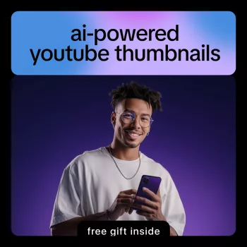
AI YouTube Thumbnails: Step-by-Step Workflow for Clicks

AI-Powered YouTube Thumbnails: A Step-by-Step Path to Click-Worthy Growth
A strong thumbnail earns attention in a crowded feed—often before a title is even read. AI can speed up the design process, generate multiple directions quickly, and help creators stay consistent across a channel without spending hours in a design tool. The key is using AI for what it’s best at (fast variation and cleanup) while keeping quality, clarity, and brand identity front and center. For more guidance, see How to Generate YouTube Thumbnails with AI: Step-by-Step.
What makes a thumbnail worth clicking
High-performing thumbnails tend to follow a few repeatable rules—regardless of niche.
- Clarity at small sizes: One focal point, minimal text, and strong contrast that stays readable on mobile.
- Emotion and intent: A visible expression, outcome, or curiosity hook that matches the video’s promise (no bait-and-switch).
- Simple visual hierarchy: Subject first, then 1–4 words of supporting text, then a secondary cue (arrow, circle, icon) only if it adds meaning.
- Consistency: Repeatable fonts, colors, framing, and composition patterns that build recognition over time.
- Alignment with the title and first 10 seconds: The thumbnail sets expectations; the opening must deliver on them.
A reliable AI thumbnail workflow (from idea to upload)
Use this as a repeatable loop. The goal is a dependable process that produces strong options fast—not a one-off masterpiece.
- Start with the promise: Write one sentence describing the viewer’s payoff (result, transformation, reveal, comparison, or shortcut).
- Pick one “hero element”: A face, product, before/after, big number, or a single object that communicates the topic instantly.
- Generate 3–6 composition concepts with AI: Vary camera angle, crop, background simplicity, and subject placement.
- Choose one concept and refine: Improve lighting, remove clutter, and reinforce the focal point with contrast and framing.
- Add minimal text only if needed: Use 1–4 words that clarify the hook, not the topic (examples: “Fixed!”, “Don’t Do This”, “$0 → $500”).
- Export correctly and verify in a small preview: Test legibility at phone size before uploading.
Step-by-step: creating a thumbnail with AI (practical walkthrough)
Step 1 — Define the angle
Pick one angle only (mistake, myth, shortcut, comparison, challenge, result). If the thumbnail tries to communicate three angles at once, it usually reads as noise in the feed.
Step 2 — Gather assets
Start with the best “real” assets available: a clean face photo, a product shot, or a simple screenshot. If the background is busy, plan to remove it or blur it so the subject stays dominant.
Step 3 — Draft 3 hooks
Write three tiny hook options that fit in 1–4 words. Aim for words that add clarity or tension, not words that repeat the title.
Step 4 — Use AI to propose layouts
Ask for variations in (a) subject size, (b) left vs. right placement, and (c) background style—such as a clean gradient, solid color, or blurred context. You’re looking for one layout that “reads” instantly before you worry about polish.
Step 5 — Refine one winning direction
Refinement is where AI should serve your intent. Remove extra objects, tighten the crop around the face/subject, and boost contrast between foreground and background. If the focal point doesn’t pop at a glance, nothing else matters.
Step 6 — Add brand styling
Lock in a consistent color accent, one font family, and a recurring element (border, corner tag, or shape). Over time, this makes the channel’s thumbnails recognizable even when the viewer doesn’t read the text.
Step 7 — Final checks
Confirm readable text at small size, avoid overly thin fonts, and ensure the image communicates without relying on text. If the thumbnail still works when the text is removed, it’s usually strong.
| Check | What to look for | Fast fix |
|---|---|---|
| Mobile readability | Main subject and text are clear at small size | Increase subject size; reduce text to 1–4 words; boost contrast |
| Single focal point | One obvious element draws the eye first | Remove extra icons/arrows; simplify background |
| Color separation | Subject stands out from background | Add rim light/glow; darken background; use complementary colors |
| Truthful promise | Thumbnail matches the video’s outcome | Swap exaggerated claims for a concrete result or clear question |
| Brand consistency | Looks like it belongs on the channel | Use a consistent font, color accent, and framing style |
Design choices that help AI thumbnails look human-made
Testing and iteration: turning one idea into consistent growth
Common mistakes to avoid with AI thumbnail generation
A structured way to learn the full process
A guided format helps creators move from random experiments to a repeatable workflow: idea selection, layout generation, refinement, branding, and final export checks. For a step-by-step sequence with checklists and a practical system, see the AI-Powered YouTube Thumbnails Ebook.
If building a consistent creative habit is part of the plan, the Money Mindset Makeover: Step-by-Step Guide to Financial Well-Being can help support long-term consistency and follow-through.
Helpful official resources
- YouTube Help: Upload custom thumbnails
- YouTube Help: Manage your channel’s branding
- Google: About misleading content and policies
FAQ
What size should a YouTube thumbnail be?
The recommended size is 1280 × 720 pixels (16:9). Use JPG, PNG, or GIF, and keep the file under 2 MB; always preview at a small/mobile size to confirm readability and keep key elements away from the extreme edges.
Do AI-generated thumbnails work better than manually designed ones?
They can, but results depend on the concept, clarity, and how well the thumbnail matches the video. AI is most valuable for speed and generating multiple variations, while human judgment and testing usually determine the winner.
How many words should be on a thumbnail?
Often 1–4 words is the sweet spot. Big, high-contrast text should support the visual hook, and the image should still make sense even if the text is ignored.


Leave a comment