-
Shop
- Advanced Technologies
- AI Career Advantage Collection
- AI Skills for Creators & Freelancers
- AI Client Management
- AI Ethics
- AI Mindset
- AI Tools & Prompts
- AI Writing & Content Creation
- Audio, Voice & Music
- Design & Visual Creation
- Email, Messaging & Communication
- Freelancing & Business
- Marketing, Ads & Conversion
- Productivity, Workflow & Automation
- SEO & Search Optimization
- Social Media Content & Growth
- Strategy, Planning & Analytics
- Video Creation & Editing
- AI Skills Mastery 2026 Collection
- Bathroom
- Best-Sellers
- Car Accessories
- Confidence
- Dating & Social Skills
- Digital Resources
- AI & Technology
- AI Skills
- Beauty
- Car Buying & Ownership
- Cozy Feast Collection
- Financial Education
- Hobbies
- Home Styling & Organization
- Kitchen & Recipes
- Mindset
- Online Business
- Parenting & Child Development
- Personal Style & Fashion
- Pet Lifestyle & Wellness
- Smart Life with AI
- Travel Planning
- Wellness
- Yoga & Fitness
- Education & Learning
- Fall/Winter 2025–26 Fashion Collection
- Family & Parenting
- Fashion
- Furniture
- Gadgets
- Health & Beauty
- Health & Wellness
- Home & Garden
- Home Electronics
- Jewelry
- Kids & Babies
- Kitchen
- Lighting
- Online Business for Beginners
- Patio, Lawn & Garden
- Personal Growth
- Pet Care
- Pet Supplies
- Pets
- Smart Amazon Shopping
- Smart Home Living Guides
- Sport & Outdoors
- Stress Relief & Relaxation
- Travel
- Travel & Adventure
- Wealth
- Popular
- Best deals
Mixing Prints Without Clashing: Simple Style Rules
The Art of Mixing Prints: A Style Guide to Pair Patterns Without Clashing
Mixing prints can look effortless when a few simple rules are working behind the scenes. The goal isn’t to “match” every pattern perfectly—it’s to create a look with a clear point of view. With the right anchor, a smart scale contrast, and a shared color story, stripes, florals, plaids, and animal prints can feel intentional, balanced, and confident for everyday outfits, office looks, and bold weekend sets. For more guidance, see Exploring adolescents’ perspectives on social media and mental ….
Why Print Mixing Works (and Why It Sometimes Doesn’t)
Print mixing succeeds when there’s a clear through line. That through line can be color (repeating one shade across prints), scale (one big motif paired with something tiny), or a shared vibe (tailored and crisp, or soft and romantic). For further reading, see Opinion Paper: “So what if ChatGPT wrote it?” Multidisciplinary ….
Clashing usually happens when patterns compete for the same job—two equally bold, similarly sized, high-contrast prints placed right next to each other with no visual resting spot. A strong base piece can fix that fast: denim, black trousers, a neutral blazer, or a solid shoe can stabilize even loud pairings.
Start With One Anchor Print
Choose one print to lead the outfit—the one you want noticed first. An anchor print is easiest when it has 2–4 dominant colors and a readable pattern: a classic stripe, a medium floral, a leopard, or a clean plaid.
From there, decide the mood you’re building: tailored, romantic, sporty, or edgy. When the anchor print sets the tone, everything else can support it instead of competing with it.
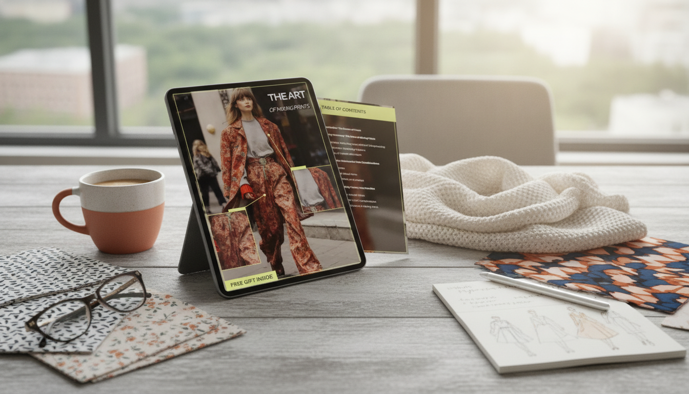
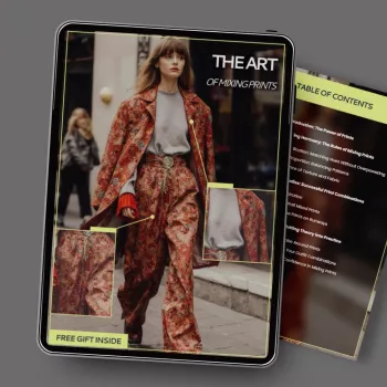
If you want a quick reference you can save to your phone or print, the The Art of Mixing Prints – A Style Guide on How to Mix Prints Without Clashing | Fashion Confidence Digital Download is designed as a step-by-step cheat sheet for repeatable outfits.
Use Scale to Create Harmony
Scale is the easiest “invisible rule” to master. Pair a large-scale print with a small-scale print for instant balance. The size contrast keeps your eye moving instead of getting stuck in a pattern tug-of-war.
Try to avoid combining two medium-scale prints with similar density unless the colors are extremely aligned. And if both prints feel bold, reduce their impact by moving one farther from the face—pants, skirt, or shoes are often safer than a busy print-on-print neckline.
Scale Pairings That Usually Look Intentional
| Anchor print | Best partner print | Why it works |
|---|---|---|
| Large floral | Thin stripe or micro-dot | Strong contrast in size keeps prints from competing |
| Bold stripe | Small gingham | One graphic pattern + one texture-like pattern |
| Leopard | Solid + patterned accessory (scarf/bag) | Animal print reads as a neutral; accessory adds controlled interest |
| Plaid | Subtle floral or dot in matching colors | Classic base print + softer motif balances structure |
Build a Shared Color Story (Simple Rules That Feel Elevated)
Color linking is what makes mixed prints look “styled” rather than accidental. Repeat at least one color across both prints; repeating two shared colors looks even more cohesive. If you’re not sure what’s working, step back and check whether your eye can “connect” the pieces through a repeated shade.
For easy wins, keep one print neutral (black/white, navy/cream, tan/black) and let the other carry the accent color. When colors differ, unify them with a third item—belt, shoe, bag, or jacket—that echoes one color from each print. For a deeper dive into how colors relate, the basics of a color wheel and color relationships can help you choose combinations that feel connected.
Pick a “Calm Print” to Act Like a Solid
Some patterns function like solids because they’re low-contrast or extremely small: pinstripes, micro-checks, tiny dots, and subtle herringbones. These “calm prints” are ideal for beginners because they add interest without adding volume.
Use Neutrals and “Breathing Room” to Avoid Overload
Outfit Formulas That Make Print Mixing Easy
For a “get dressed and go” routine, pairing a style plan with a calm mindset can help. If you like checklists, you may also want Essential Oils Relaxation Checklist – Simple Daily Ritual Guide Featuring the best essential oils for relaxation for Stress Relief, Sleep & Calm Living and Fuel Up & Fire Ahead: Your Entrepreneur Quote Action Checklist | Motivation-Driven Digital Checklist for Entrepreneurs—both easy add-ons for building consistent habits.
Common Clashes and Fast Fixes
Confidence Checks Before Leaving the House
A Printable, Step-by-Step Reference for Mixing Prints
If you want a ready-to-use resource, the The Art of Mixing Prints – A Style Guide on How to Mix Prints Without Clashing | Fashion Confidence Digital Download is built for quick decisions—especially on mornings when you want to look pulled together without starting over three times.
FAQ
How many prints can be worn in one outfit without it looking messy?
Two to three prints is the sweet spot for most outfits. Four can work when the palette is tightly shared, one print is “calm” (like a micro-check), and you’ve added solid pieces for breathing room.
What are the easiest prints to mix for beginners?
Start with stripes, polka dots, small checks, and leopard (it often behaves like a neutral). Match at least one color across the prints and vary the scale—one larger, one smaller—for instant balance.
Can mixing prints work in professional or office outfits?
Yes—keep colors classic (navy, cream, black), use one calm print, and add tailored structure like a blazer or crisp trousers. Limit accessories so the outfit looks polished rather than over-styled.
Recommended for you

Baldinini Trend V-Neck Sweater: Fit, Style & Care
Jun 29, 2026


Leave a comment